Old designs

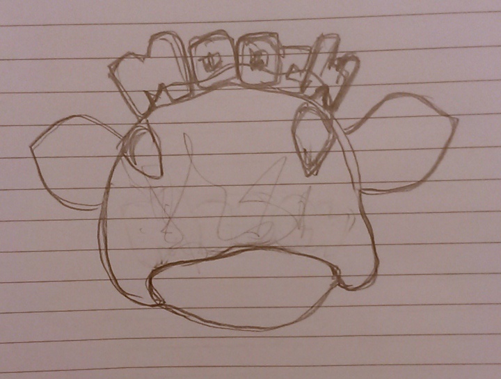
I contacted the designer who had the originals design to the Mooch logo. I thought that if I were to alter and develop a new logo, I may as well start from the beginning with the original “Mooch” and trying to keep in line with the themes he had used.  It was quite difficult at first to obtain these designs as he was skeptical to hand  over the designs but in the end I managed to convince him. Here is what I got from the designer:

Screen Shot 2014-01-15 at 06.19.07

and the font for it too!

Fonts

MoochlogoAll

It was a little harder than I thought.  I wanted to keep the design of these fun! these are just some of what i have come up with already.  Hoping to pick at my brain for a few more varied designs.  I did however liked a few that I came up with on that paper:

20140115_000531 20140115_000523 20140115_000537 20140115_000547

Top left is just a simple handwritten one.  It’s a pretty basic design and i thought it looks professional – maybe throw in a few colours and it’d be looking fun!! The design next to it has the two “o’s” in  cow pattern and they sort of scrunch to the middle as if it’s saying “Mooch” with puckered lips! The second design is just what the previous one is like without the cow prints!  The last design is a bubble writing, something that I loved doing when I was smaller.  I just remembered myself looking at fonts like them and wondered where would they use it.  I thought that the font suits for this project because of it’s appeal.  And is definitely a representation of one of the key words – “Fun”

Cows Cows Cows

I have been looking at various pictures of cows (funny as that may sound) to incorporate it into the design part of my project!

I want to redesign Mooch logo:

MoochTagline

which can be seen above.  It’s a nice logo, don’t get me wrong.  Simple, clean and crisp.  the colours are clear and easy to the eye.  I quite like the colour scheme that Mooch is already on.  I think the white, purple and pink goes well together.  I don’t want to change the colour scheme as much.  Maybe just swap around the colours for a logo to get different vibes from it.

Below are the pictures of two cows that I found that may go well with the logo.

cow cow2

I have also sketched a few of them:

20140115_003626 20140115_004500 20140115_011258 20140115_011303

the top two sketched cows, I wanted the words “Mooch” to be somehow on the cows teeth while it’s grinning.  I thought this might appeal to the youth more – as chosen from the key list

Logos

Had in my head that Mooch should be handwritten design.  I was looking at Yogism amd Froberry’s logo design and how they designed theirs.  I found that Yogism’s logo is colourful, playful and quirky.  Its just a simple black shape with Yogism typed in colours.

Yogism


simple and yet distinctive! Froberry’s logo also has that simplicity! A pink love heart and a frozen yogurt top! It’s cute!

Froberry


Hoping to start on the sketches of the logo soon!


S.M.: 5

Last meeting with the supervisors today before the break.  I showed them what was given to by the business student about the marketing campaign.  Approvals were given, but they also said to steer away from the project getting too business-like instead of a creative digital media project.  I was told that I’m making slow progress, but progress nonetheless.  All there is left to do now is to go on to the next stage of the project.  All this while I’ve been slightly experimenting with different logo designs – which I will post on a separate post.

Marketing Angle

To help me with the (traditional) marketing side of things, I met up with a few business students who explained to me how to go about planning a marketing campaign.  From the last supervision meetings, I was told that i had to basically nearly come up with a campaign for Mooch.  Something which I know not off.  Fortunately for me, my business friends passed on some notes to me that I hope will help me with this process!

They had a lot of things more to the business side, but I picked out what was most relevant to me:

  • Identify key customer group
  • Awareness of key competitors & their digital marketing strategies
  • Digital Marketing plan – Proposed strategy & objectives, tools.
  • Present creative ideas to be utilised as part of the digital strategy.

Hoping to further develop from these points later on in my final year project process.

Panda Cheese

This commercial about panda cheese is absolutely brilliant.  They have a catch phrase that they use constantly for all their ads.  It’s funny and memorable and weird.  Definitely inspired me to do something similar like this based on the key words I’ve gathered from the brainstorm session! Simple and straight to the point commercial about how if you say no to panda cheese, a panda will appear out of no where and wrecks everything on you! Funny 🙂

Key Words (recap)

Based from yesterday’s brainstorming session the following words was put together:

  • moose
  • cow
  • community
  • fun
  • lips
  • kiss
  • “it’s not a joke”
  • dessert
  • lazy
  • topping
  • grass
  • cold
  • sexy
  • healthy
  • tasty
  • fit
  • cozy
  • juicy
  • cream
  • fat free
  • white & purple
  • small
  • treats
  • good
  • ethical
  • youth

I looked over all of those and came up with a finalised list with ones that I thought would suit “Mooch” more:

  • Community
  • Cow
  • Fun
  • Healthy
  • Youth
  • Ethical
  • “It’s not a joke”

The last point was actually a phrase that came up that somebody had suggested.  “It’s not a joke” means that all the benefits talked and mentioned about frozen yogurt is not a joke, or should be doubted that it is fat free or healthy or fun.

From this point I guess what I have to do now is to try incorporate these key points that i have chosen to anything ideas I have for Mooch.

Brainstorming

Mooch

Aside from the supervisor meetings, I had met up with another supervisor for my FYP.  Just because the way it works in the meetings is that 2 supervisors look over what has been done for that week.  I just wanted another different opinion on my project.  I discussed my video ideas and the supervisor agreed like the rest of them that there wasn’t a hook for the audience and that they were just random ideas. He had also said that maybe it’d be a good idea for me too brainstorm the word “Mooch” itself, and see how that goes.

I gathered 3 people to sit down with me for this brainstorming session and wrote down on a piece of paper the end result of this exercise. Below is a picture of that paper.

20140108_130031

S.M.: 4

Haven’t really done anything much since last supervisor’s meeting.  I have made contacts with a person that is in-charge of slimming world and am going to just ask her a few questions about their health rules and if frozen yogurt would fit into that.  I told the supervisors of my 4 ideas for advertisements for Mooch (which I will hopefully post up in detail soon!) The feedback I got was that i needed more of a core concept and was told that my ideas was just random ones.  I need to come up with ONE strong idea or a reason for the ad.

But I was also told that I’m onto something good and doing ok….hmmm.

thinking I need to rethink my ideas!